Accordion panel plugin changes
The second plugin to receive an update to Compass’ design language and functionality is the widely used “Accordion panel” plugin. Here’s what you can expect:
- CSS/HTML structural changes
- New features in functionality, such as group context, expand/collapse all toggles, advanced keyboard navigation, and more
Visual changes
Old styling
Historically, this plugin has taken its design and functionality queues from existing frameworks such as Bootstrap. In addition, some template systems, such as Katmai, slightly tweak the styles to better match the overall color palette.
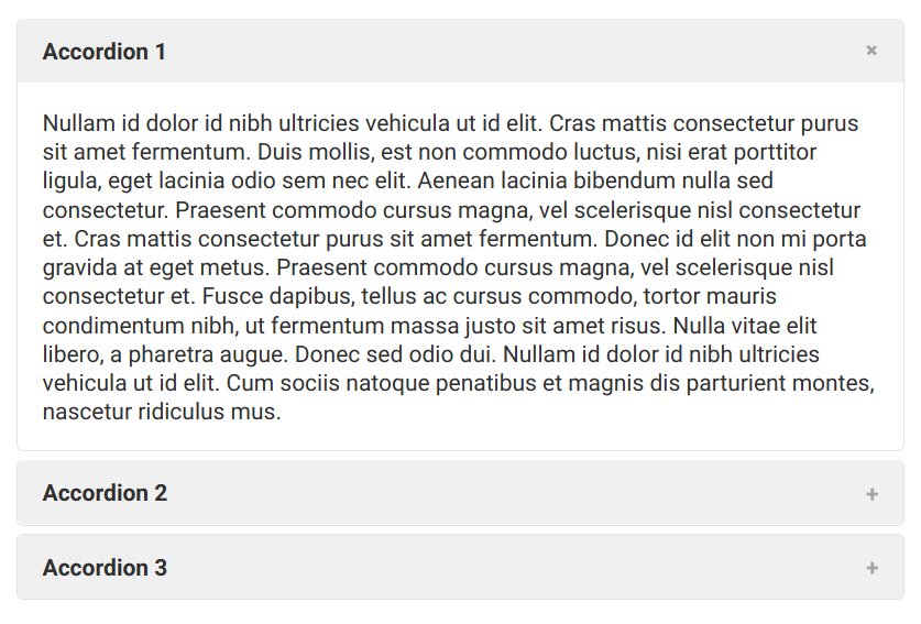
Overall, the old design is minimal and unobtrusive. However, it does have some setbacks:
- Having panels spatially separated can be confusing for users to understand they work together as one component.
- All accordion panels on a page, when toggled open/close, will collapse any other accordion panels elsewhere on the page, even if they are not within the same visual group.
- There is no ability to expand or collapse all accordion panels within a group.
- There is no expanded keyboard functionality beyond the defaults to allow users primarily using keyboard navigation to easily sift through accordions.
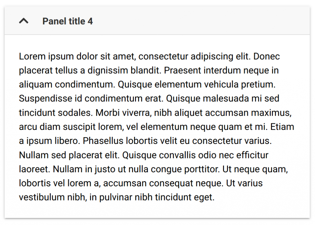
New styling
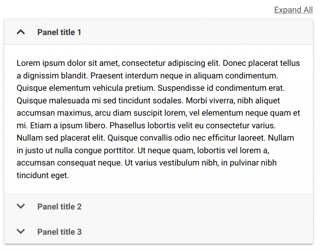
The new design addresses all of these concerns. For starters, accordion panels are visually and functionally grouped, meaning there’s no space between each panel, and collapsing/expanding a panel within a group will not collapse accordion panels in another group somewhere else on the page.
In addition, an “expand all” button will appear on accordion panel groups larger than 1, which will expand all accordions and convert the button to “collapse all.” For accordion groups of 1, the expand/collapse all button will not appear:
One of the biggest leap forwards is the advanced keyboard navigation now enabled on this plugin.
- Up arrow – If an accordion panel heading is focused, it will focus the previous accordion panel’s heading. If the focused accordion panel heading is the first within a group, it will focus the last accordion panel’s heading.
- Down arrow – If an accordion panel heading is focused, it will focus the next accordion panel’s heading. If the focused accordion panel heading is the last within a group, it will focus the first accordion panel’s heading.
- Home – If an accordion panel heading is focused, it will focus the first accordion panel heading within the group.
- End – If an accordion panel heading is focused, it will focus the last accordion panel heading within the group.
These changes were directly influenced by WAI-ARIA’s guidelines on accessible accordions, and will help push accessibility at VCU even further. Of course, previous functionality such as pressing space or enter while focused on an accordion panel to toggle it is still present, and the ability to link to an accordion panel and have it open when scrolled to is still baked in.
Code changes
Per the last plugin update, these changes of course come with structural changes, with additional functionality changes as well. One of the biggest steps is a switch to the BEM class naming convention within the CSS for better maintainability and readability.
A detailed description of the code changes was sent to the T4Dev listserv (subscribe to receive future updates).
Change management
This change is scheduled for 9AM on Thursday, April 30th as documented in Change Management 6306. If you have additional questions, feel free to reach out to the Web Services team at t4admin@vcu.edu.
Categories Plugin updates