Plugins system to adopt Compass
Over the coming months, Web Services will begin updating the T4 plugins system so select components align with Compass, the university’s new web framework. This update will impact the styling and functionality of specific components used throughout VCU’s websites.
Web Services chose to move forward with this implementation plan to demonstrate our commitment to and confidence in what Compass can achieve for the university’s web presence. Check out our Compass FAQs to see how we expect the framework to benefit VCU web audiences as well as the university web community.
What to expect
Compass components replacing current ones in the plugins system will roll out individually. Web Services will provide a two-week notice ahead of each roll out, allowing time for developers and website managers to make any changes needed to ensure their website(s) are ready. To receive these notices, subscribe to the T4Dev listserv.
Each notice will feature:
- A summary of what to expect
- Detailed explanation of changes
- Side-by-side photo comparisons
- Side-by-side code comparisons
- Instructions on how to access the related ticket in Cherwell
The first set of impacted plugins (with roll-out dates) includes:
- Hero (April 23rd)
- Accordion Panel (April 30th)
- Modal (TBD)
- Content Well (will be renamed Callout) (TBD)
We anticipate rolling out two component updates per month, with each update spaced one week apart to provide the web community with adequate time to prepare.
Hero plugin
The first plugin to receive an update to Compass’ design language and functionality is the “Hero” plugin. Here’s what you can expect:
- CSS/HTML structural changes
- New features, such as floating captions, blurred backgrounds and more
- Content area specific styles
Visual Changes
Historically, this plugin has included minimal, inline styles and required developers or template systems to provide further styling. For instance, Katmai styles this plugin as follows:
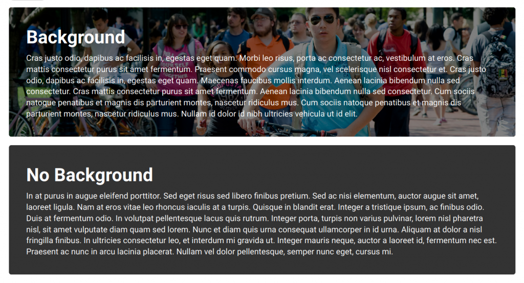
The default behavior of the plugin has been to set the background image to scale to the hero’s size, which is dictated by the amount of content within it. This brings up the accessibility concern of not including alt text for an image, not allowing for different positions of the caption to ensure the image is optimally visible, and the overall plugin is treated more as a content well as opposed to a proper hero. All of these concerns are addressed in the coming update.
Regular content area
For use within the regular content area, there will be different visual presentations for heroes that are using background images as opposed to not.
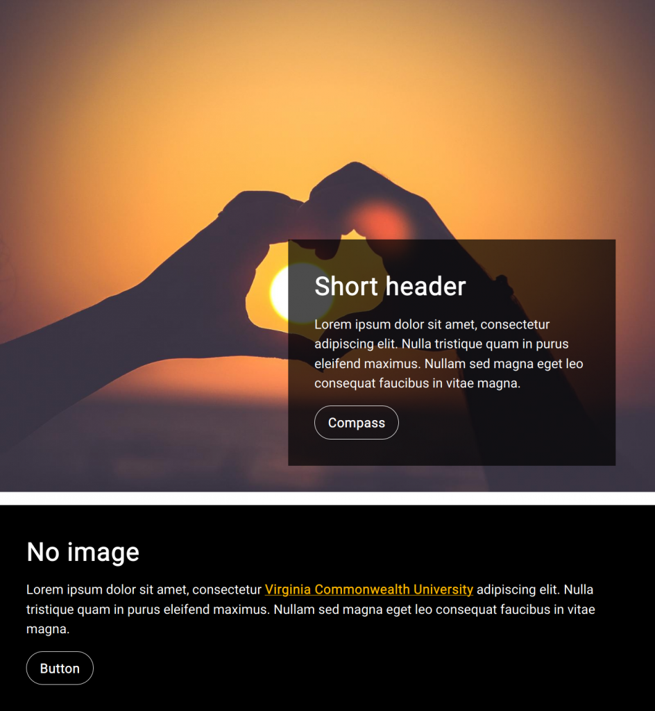
Hero with an image: The hero will take the aspect ratio of the image provided, floating the caption to the center bottom by default. The caption’s position can be adjusted to the right or left using the class name injector (plugin-hero–caption-left to set it to the left, and plugin-hero–caption-right to set it to the right).
Hero with no image: The behavior is similar to what it has historically been (taking the shape of the caption inside), aside from the included styles of a black background with white text to ensure optimal readability and contrast.
Feature and footer areas
To extend the visual clarity further, heroes will be styled differently when used anywhere other than regular content area (feature, sidebar, and footer areas). This functionality is dependent on whether your template supports it.

For heroes used in the feature or footer areas (by adding “feature” or “footer” to the name), the image will be centered within the plugin’s container, padding out the left/right negative space with a blurred/darkened version of the image to provide visual cohesion; This blurred negative space will only be displayed on viewports larger than 1400px wide.
Sidebar area
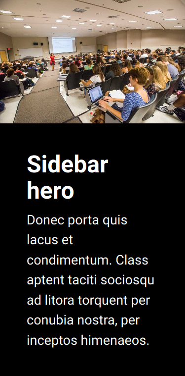
For use within the sidebar area (by adding “sidebar” to the name), and for all heroes when presented on small screens, the caption will gracefully stack under the hero’s image, ensuring optimal readability when low on screen real estate.
Code changes
Of course, with these visual changes comes structural changes. One of the biggest steps is a switch to the BEM class naming convention within the CSS for better maintainability and readability. In addition, there is different HTML structuring used for heroes with or without background images, giving it more contextual importance to screen readers.
A detailed description of the code changes was sent to the T4Dev listserv (subscribe to receive future updates).
Change management
The hero plugin change is scheduled for 9 a.m. on Thursday, April 23rd, as documented in Change Management 6272. If you have additional questions or feedback, feel free to reach out to the Web Services team at [email protected].
Look for more roll-out notices in the weeks to come!
Categories Plugin updates