Compass 1.8.0
The latest version of Compass comes with all new colors and other minor visual changes to follow the new VCU brand guidelines. These changes will roll out the last week of July/first week of August 2024.
Colors & accents
Compass will soon ship with a set of new colors directly pulled from the new VCU brand guidelines.
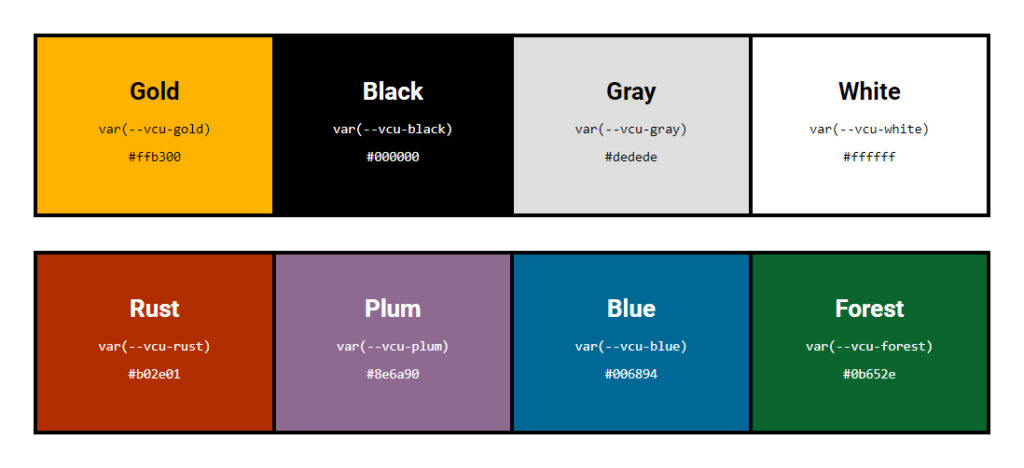
Here’s some important things to keep in mind:
- All new colors are globally available via new –vcu- prefixed CSS custom properties. They are also mapped to the old CSS custom properties for better compatibility.
- Gold has a slightly different hex value than before. It is now
#ffb300instead of#f8b300. - The only accent color that is unchanged is blue.
- Rust is the new, default accent background color (it was previously blue).
Distribution
In addition to new colors, the new VCU brand guidelines also influence how these colors are used throughout a web page. Brand colors of black and gold with neutrals of white and grey should be dominant.Accent colors should be used for emphasis only, and take up around 10% of a page.

Changes
With these new colors and how they’re distributed in mind, Compass needed to rework how components are styled and where/how users can configure a custom accent color to better follow the new brand.
Header & navigation
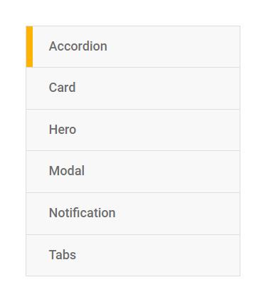
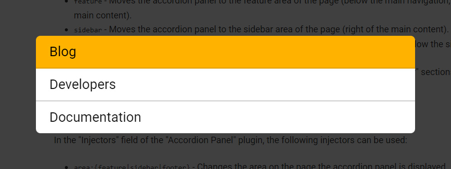
The header quick links (when viewed in modal or mobile mode) and the light variation of main/sub navigation components no longer use the configured accent background color. They use gold/black instead.
Breadcrumbs
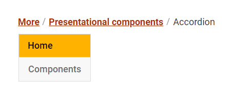
The breadcrumbs component now leverages the accent background color for its links, except for its “More” menu, which uses gold/black.
Links
Links now use the configured accent background color! This means that by default, Compass will ship with rust colored links.

Markers, buttons, & blockquotes
Markers (along with the left double quote of blockquotes) now use a new flag/bookmark shape instead of the old angled shape. Buttons now use a gold background with black text instead of a blue background with white text. Blockquotes have been altered to use the configured accent background color for the left double quote embellishment and attribution (it no longer uses it for the top/bottom borders).

Cards
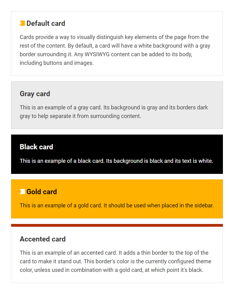
Cards have many new styling options available! Not only can you now use a gold (automatically used if used in the sidebar area) and black themes to change things up. The biggest change is that accent cards are no longer a theme, but a modifier that can be used with any other theme to add a strip of color to the top of a card for extra emphasis.
Footer
The footer no longer offers a light variant, creating more consistency across websites using Compass and with the new VCU brand guidelines.
How to get help for your Compass website
This update may introduce some issues, especially if your site is highly customized. Additionally, the new university brand may require some changes. That’s why the Compass team is available to help!
Web consultation with Technology Services: Not sure how to update your website? Technology Services offers bi-weekly open consultations for helping with websites that use the university’s CMS (Terminalfour) and the Compass Web Framework. Join a Web Services consultation.
Brand consultation with Enterprise Marketing & Communication: Reach out to [email protected] with any brand-related questions.
Categories Releases